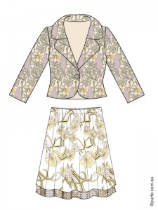
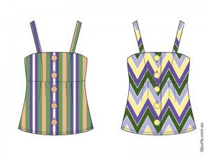
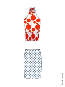
Every season style blogs are filled with reports of trendy prints and the ways to mix them for the perfect outfit.
There is a myriad of tips like “Look for patterns that complement each other” or “Limit patterns to two” and even “Leopard goes with everything.”
These might be great examples of what works, but in this article I will cover the logic behind it, why it works. And why it doesn’t when it doesn’t.
“So, what principles considered the base of a perfect pattern combination?” you might ask.
 First of all, in a well-designed outfit you would straightaway notice the strong, active print (or a color, shape) that sets the theme. The other details are working to reinforce that. An outfit needs to be structured to make it easier for the viewer to perceive the parts of composition. A glance will go to one part after another, starting from the most active (accent) to the quietest and neutral one creating the feeling of agreement and consistency.
That’s why an outfit that contains two or more identically intensive patterns causes visual confusion. The observer will be switching between them unable to identify the main and the subtle one.
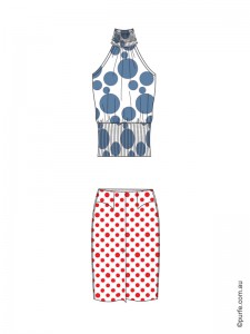
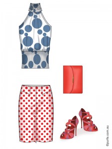
At first glance the garments above are combined according to the basic rules of mixing patterns. The scale is right – polka dot on skirt goes well with large circles of the top. The color combination is fine, complementary hues are used. But something just doesn’t feel right, isn’t it?
That’s because they doesn’t follow the main principle of print mixing: to achieve the harmonious look patterns should be of different intensity.
Below are the rules that will help to identify which of two patterns is dominant.
The balance in pattern mixing could be achieved through
Levels of pattern coherence:
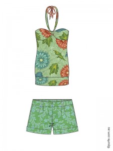
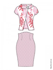
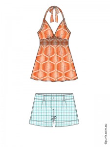
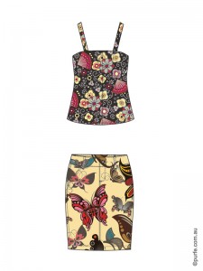
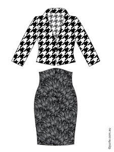
These rules of pattern mixing work well considering all other characteristics are equal. In other words, between two patterns of equal size the lighter one will dominate. Between warm and cool ones of similar brightness conspicuous will be the one which is more pure and “warm”. Few visual examples below:
Q: If we have two dramatic patterns of a similar color shade and tone, would it be possible to wear them together and still have a balanced look?
A: The answer is yes.
Q: In that case which of them will be accent?
A: Neither. Our vision is very good at noticing objects that stand out. Have one butterfly printed on the shirt and it will be the first thing everyone will see. Have a hundred of them and a tomato sauce stain and guess what people will look at. Same is here, we would need something to stand out. It could be plain color or accessory, e.g. nude shoes, a tan leather bag or big brown sunnies.
Now, let’s get back to the example described at the start of the article and think how we can fix it.
The set on the left feels a bit “undecided”. And indeed, it breaks the main principle of mixing patterns of different intensity. The polka dot, in spite of its size, is conspicuous by color while top’s circles dominate by size. So these garments are disputing on the level of color and scale. Two active prints are clashing and cause viewer “to jump” from top to skirt and back again while being unable to decide which of them has the priority.
If we simply swap the colors, – make a polka dot pattern in shaded blue, and circles on of the top in pure red, the harmony will be achieved. Now bigger and warmer print has full control over the smaller and cooler one.
In real life where we cannot easily change the color of our clothes (tomato sauce aside). I would then suggest to find another pair to either skirt or top. Or, try to add the accessories to improve the look. More shopping to be done in any case!
It may seem difficult at first to keep all these things in mind. But it’s like learning to drive a car. When you first get behind the wheel you are overwhelmed by all the tasks you need to do at once: following the rules, checking the signs, keeping the speed and changing the gear (if you unlucky enough to have a manual). Once you get a bit of experience it becomes too simple. Suddenly you are a pro driver ready to show anyone few tricks, think you can do it with one hand while drinking a coffee with another. At the end, it is all about few simple rules and a bit of practice.
You may also like to read about:
How to Coordinate Colours in Outfit, Designer’s Method

