Why is contrast important?
While putting an outfit we aim to create a composition where all details are in their place and the whole look is complete and pleasant to the eye.
There are a number of subjects to keep in mind when arranging a composition. The important one that I would like to talk about here is contrast.
The abstract idea of contrast is one of the fundamental principles of our Universe. Mountains and plains, oceans and dry lands, positive and negative charges, high and low pressure – they are all contrasting in their state or force, and it is through this interaction the word exists.
Recognising contrast is natural for humans. We differentiate objects because they are contrasting , we use this difference as a reference point.
For example, Eiffel tower (300m high) is quite lofty for an average human, but it is dwarfed by Burj Khalifa building (828m) in Dubai when two are put together.
Contrast and outfit layout
Back to the subject of clothing. Being curious human beings it is our second nature to look for new experiences. A visually interesting item in this regard would be something that induces our eyes to explore or as Diane Vreeland put it: “The eye has to travel”.
Introducing layers of complexity into the look by adding various textures or using multiple colours gets our attention. Put it another way, contrast is used to enhance an outfit by giving tedium an appeal, a life buoy, reducing the repetitive impact.
Contrast can be created in several areas
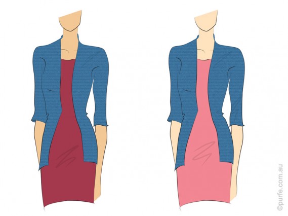
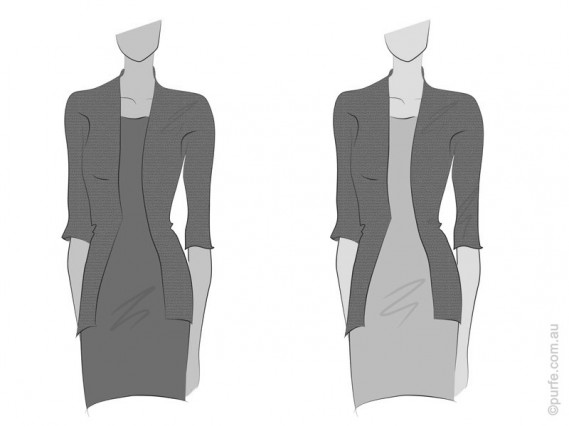
Ideally the difference of brightness in an outfit should be in direct relationships with wearers’ complexion. What I refer to here is the natural contrast created by skin, eyes, and hair tones. The more contrasting features woman has the wider brightness range in garments she could afford to wear. And on the contrary, the less contrasting appearance demands for the lower brightness contrast in clothes.
Back in the real world, the illustration below shows outfits made in contrasting colours. The sangria and blue dress on the left have low brightness contrast while the pink one at the right is much lighter than the jacket and so it will do great on person with high contrast complexion.
For example big bag would appear even bigger if it is carried by a petite girl. Or, speaking about moods, imagine fitted stiff coat with bulky scarf thrown upon it. Strict lines of a coat are perfectly unbalanced by the casual style of the scarf.
The simplest way to make texture contrast is to use fabrics with straight opposite characteristics: glossy – matt, sheer – opaque, stretchy – firm and so on. There is, unfortunately, no proven recipe book on how to mix multiple textures. Some experimentation and observation of what works is a way to go here.
Few notes to consider about textures:
- Various textures reflect light differently. Nap fabrics (like velvet, fleece and felt) make colours appear more rich and saturated because of their fuzzy surface. In contrary, smooth and shiny ones reflect more light. That creates gloss and bleaches the surface. Therefore, the same colour in silk will appear lighter than on velvet.
- Moreover, fabrics hold dyes differently. The colour on cotton gabardine will look a little bit lighter than on wool as wool tends to retain dye better.
Even though lack of variety can be tedious, contrast should be used with care. Too much of it and there will be several focal points competing for an attention and affecting unity of the overall look.
As you can see contrast is the ultimate attention grabber. It can work on many levels and is to be used with comprehension taking into account person’s style and personality.


